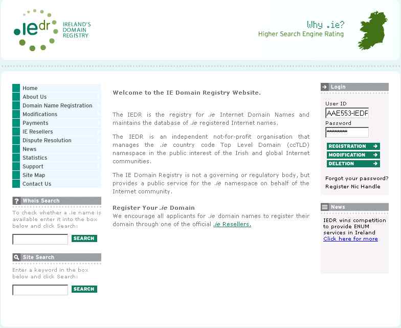
Back in December of last year I mentioned the IEDR’s planned rebranding.
They have finally unveiled the new site design this afternoon.
Although I’m not a designer I like the new look and feel:

Unfortunately not all elements of the new site will work perfectly in all browsers, but it is a definite improvement on the previous design and layout.


Am I allowed say its about time?
I must say, I think it’s a step backwards. I’m not extremely familiar with the old site (is there a cache anywhere?), but I seem to recall it being a little more readable for a start.
The text on this site is small (and un-adjustable in the header, navagation and element headings) and it is of a low contrast. Visually impaired users would have difficulty using it, especially on high-resolution screens. In fact, I have 20/20 vision and am using a low-res screen; it’s not easy to read large portions of text on the site.
The animated header is unnecessary: how does it help the visitor? It doesn’t even look great and the header text is small and over-aliased. Screen readers and search engine bots will see nothing for the header. Anyone that knows anything about accessibility/SEO knows how silly this is.
The news ticker is not useful: most sites want to display their most recent news; here I can only see the recent headline sometimes, and when I do, I don’t know which one it is! 🙂
The front page is poor by any standards. I don’t know what the most popular requirement of an IEDR visitor is, but whatever it is, it shouldn’t be hidden in a tricky navigation bar.
And does it validate? Nope.
I know where you’re reaction comes from, Michele, on first impression I thought: “Oh, different, fresh, new logo, new colours, etc.” But it’s only the change that’s interesting. All-in-all it’s a bad website; but about right by Irish standards. So well done guys! 😐
Anyone know who did this?
Eoghan
I know there are some issues with the text size, but as a very regular user of the site I am quite happy with the fresh look and improved navigation.
I think, though I could be wrong, that Creative Inc did the new design.. Can someone else confirm that?
the opera issue should be resolved now… a lonesiome tag
Anon
Glad to hear it, though it wouldn’t affect me, as I haven’t used that “browser” in years 🙂
Design is nicer, but it looks like they spent another whack of money on a custom job for the basic frontend, when all that was needed was something like WordPress. Borked on FF a lot of the time too. Why am I not surprised?
Because you are naturally cynical? 🙂