I’ve always enjoyed data visualisation tools. Taking data and turning it into something that is visual can make it much easier for people to digest the content and often it shows you new things that can be a little surprising
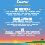
When it comes to my listening patterns, however, there aren’t any “big” surprises, but this little tool does a nice job of making it interesting visually:

Instafest can pull in data from Spotify or Last.fm. As I have been using different music services for years and have a habit of switching around the only thing close to being a constant is my last.fm data, as I have been fairly consistent at sharing my listening with the service.
A lot of what I listen to is soundtracks or soundtrack adjacent as it is often without lyrics and less distracting than some other types of music. And yes lots and lots of Hans Zimmer!


Leave a Reply