Although Google has made a lot of improvements to the Adsense publisher centre over the last couple of years (I’ve been a member for the bones of 4 years!) it still lacks some basic features – graphs.
Trends are a wonderful thing, but plotting them can be a real pain in the neck.
Of course there are a number of solutions currently available to publishers (see this thread for discussion), but I always like having options.
Last night Robin asked me to test out a new “toy” he’d thrown together, which he refers to as a “mashup”. Personally I dislike that term. It sounds far too negative and messy. Referring to it as a “hack” would be more positive in my eyes, but that’s just me.
The system Robin’s put together is very simple.
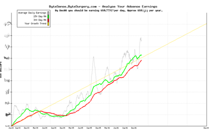
Login to your adsense account and run an advanced report for the period you are interested in. So, for example, you could have a look at the 12 month period spanning January 1st 2006 to January 1st 2007. Once the report has displayed you can download the CSV version of it (for some dumb reason it exports as report.csv, so you have to manually rename it if you want to run several reports to compare periods!).
You can then upload the CSV to the site and it will generate a nice graph for you.

Not only will it show you your earnings over time, but it will also predict your future trend, which is pretty cool.
The graphs at the moment aren’t the prettiest, but it’s incredibly functional and easy to you.
Well done!
Footer
Site hosted in Ireland by Blacknight - Content copyright Michele Neylon


Let the speculation as to what Michele earns per month begin 🙂
BTW did you see what lily’s chocs was returning to the Google useragent?
That’s what I meant about waiting for the call. But they seem to be watching – it’s fixed now. Any idea how long the new site was live?
Richard
You can speculate as much as you like 🙂
Until I hit 5 figures I’m not saying much !
I saw what Lily’s was returning alright – not good! It originally gave a 500 error on any attempt to access the site with lynx
Someone is watching !
M